Clear decisions depend on clear interfaces. This UX case study redesigns the currency exchange experience, applying user research and cognitive-load reduction principles directly transferable to dashboards and data-driven tools.
Project Links
This is a rare non-data project, but a foundational one. By speaking with travelers and refining the user flow through rapid tests, I focused the design on simplicity and trust. The process sharpened how I think about user intent and cognitive load, reminding me that the same UX principles of empathy, clarity, and visual guidance apply to data storytelling. It directly changed how I design dashboards and analytical reports; I now run usability tests on my work. Plus, Figma’s a fun toy.
Project Overview
This project turned live currency rates into a fast, trustworthy decision tool. The goal wasn’t just conversion speed, but decision confidence, a principle equally critical in data products.
I designed a componentized Figma prototype and grounded it in user feedback gathered through semi-structured interviews and a short survey. Usability testing revealed that travelers weren't just looking for quick conversion; they needed confidence. That insight guided refinements: a clear conversion CTA, cleaner hierarchy, and better accessibility.
The final interface combines real-time conversion with location-aware suggestions, revealing only what’s relevant at the moment of decision. By applying hierarchy, contrast, spacing, and progressive disclosure, the design minimizes mental load and enhances clarity.
Even as a UX prototype, this work illustrates how user research, interaction design, and visual simplicity directly translate into effective dashboards, data storytelling, and insight delivery.
Gallery
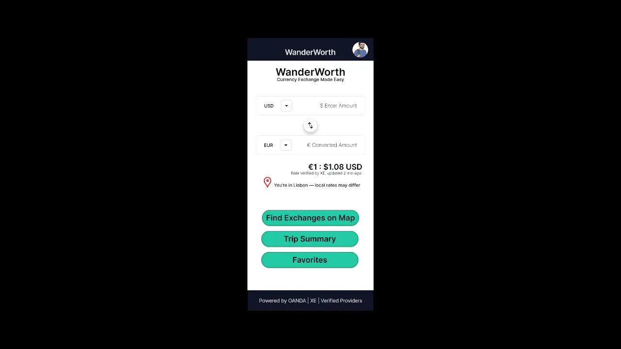 High-fidelity prototype: tested on users to refine layout,
micro‑interactions, and trust cues before developer handoff.
High-fidelity prototype: tested on users to refine layout,
micro‑interactions, and trust cues before developer handoff.
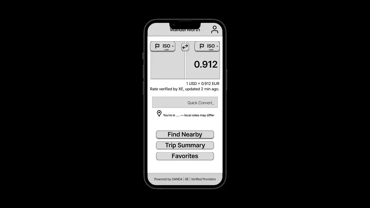 Low-fidelity prototype: wireframes connected for early usability
testing to validate flow and basic functionality.
Low-fidelity prototype: wireframes connected for early usability
testing to validate flow and basic functionality.
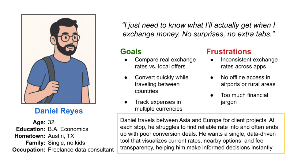 Persona: a hypothetical frequent traveler used to shape task
flows and accessibility needs.
Persona: a hypothetical frequent traveler used to shape task
flows and accessibility needs.
References
No external dataset. The project was completed as part of the Google UX Design Professional Certificate.