Interactive dashboard of utility bills over time. Tracks inflation in household energy use, turning everyday costs into a data story you can see and plan around, revealing inflation and energy-use trends at a household scale.
Project Links
I built this project as a personal data diary to track my home utilities, a playful experiment that quickly became a compact case study in small-data analytics. What started as a way to capture everything from electric company headaches to Harvest Party cleaning discounts soon revealed clear inflationary trends, seasonal patterns, and energy-use tradeoffs. It’s proof that even small datasets can support meaningful planning, spark energy awareness, and tell big stories.
Project Overview
The Utilities-313 Dashboard is a web-based tool designed to analyze and visualize household utility expenses. The emphasis was not scale, but clarity, automation, and usability.
Built with JavaScript (D3 and Plotly) and styled for mobile responsiveness, it features interactive tables and charts—including stacked bars, time series, and treemaps—that allow users to explore trends, compare spending categories, and understand fluctuations in their utility bills.
Behind the dashboard, a Python-based exploratory data analysis (EDA) report, generated in Jupyter Notebook using pandas and Plotly, offers deeper statistical context. The report updates automatically through a streamlined data pipeline utilizing the Google API, ensuring fresh insights with minimal manual effort.
This project demonstrates my ability to manage full-stack data workflows, from ingesting and processing data in Python to building interactive, user-friendly visualizations in JavaScript. It merges practical utility tracking with thoughtful UX, making personal finance data both understandable and engaging.
Gallery
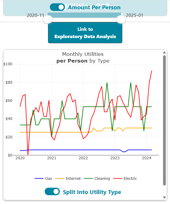 Interactive web dashboard: Toggle between cumulative and
per-person amounts, with a time filter slider for detailed expense
analysis.
Interactive web dashboard: Toggle between cumulative and
per-person amounts, with a time filter slider for detailed expense
analysis.
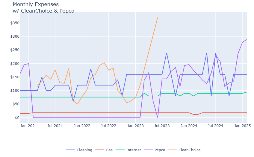 Exploratory data analysis: Line chart tracking expenses by
category over time.
Exploratory data analysis: Line chart tracking expenses by
category over time.
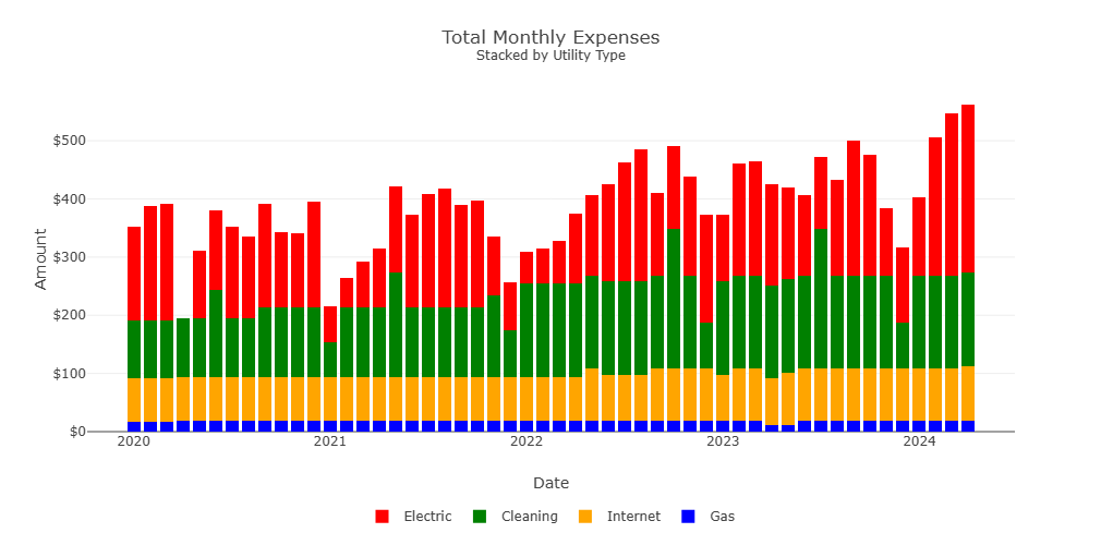 Stacked bar chart: Monthly utility bills by type, highlighting a
steady rise in electric expenses.
Stacked bar chart: Monthly utility bills by type, highlighting a
steady rise in electric expenses.
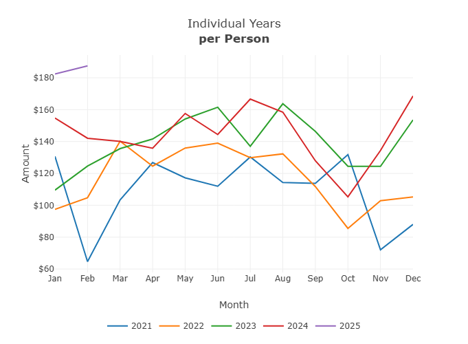 Monthly bills by year: Each line represents a year, revealing a
clear upward trend in expenses.
Monthly bills by year: Each line represents a year, revealing a
clear upward trend in expenses.
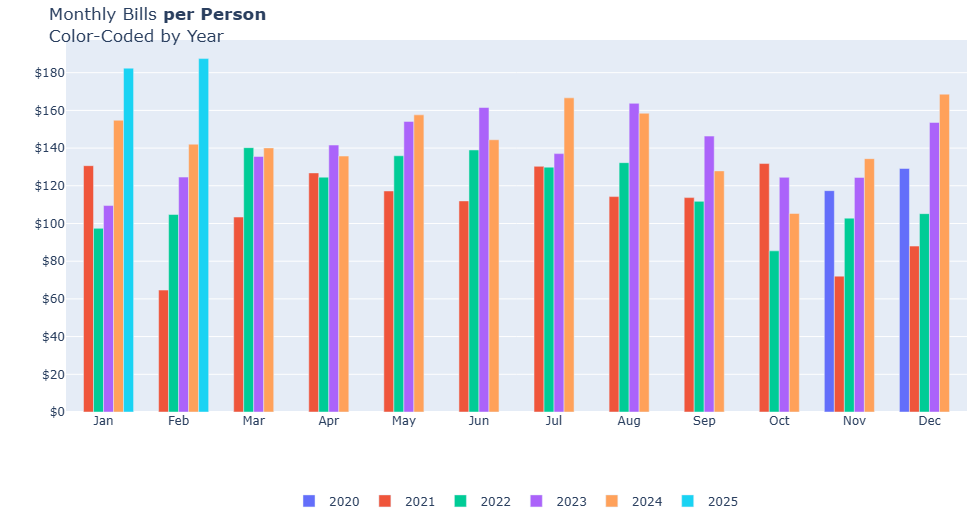 Monthly bills: Bar chart color-coded by year, further
illustrating increasing costs over time.
Monthly bills: Bar chart color-coded by year, further
illustrating increasing costs over time.
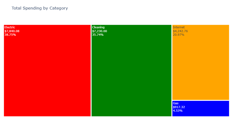 Treemap: Visual breakdown of expenses by utility type, showing
the proportion of each category.
Treemap: Visual breakdown of expenses by utility type, showing
the proportion of each category.
References
Dataset provided by Utilities 313.