A real-time interactive map visualizing global earthquake activity, designed to make seismic patterns intuitive and accessible to a general audience.
Project Links
This was my first-ever map, and I still have a soft spot for it. It shows the last 30 days of global earthquakes in real time, layered with tectonic plates and a heatmap. Building it was a turning point in how I think about spatial data: I learned how layering, scale, and interactivity shape how people perceive complex systems, lessons I now use in more decision-driven data work. Any time I hear about a quake on the news, I still pull it up.
Project Overview
This project visualizes global earthquake activity from the past 30 days using real-time data from the USGS GeoJSON API. Built with JavaScript, Leaflet, and D3, the map integrates multiple data layers: earthquake points, tectonic boundaries, and a heatmap to show seismic hotspots.
Users can explore detailed quake info by clicking on markers and toggling layers. The tool is designed to make seismic trends easy to grasp, helping inform both the public and policy conversations.
It demonstrates my ability to combine live data, mapping libraries, and layered interactivity to deliver accessible, science-driven visual storytelling. While primarily educational, it shows how live data and layered maps can surface system-level patterns that static charts often miss.
Gallery
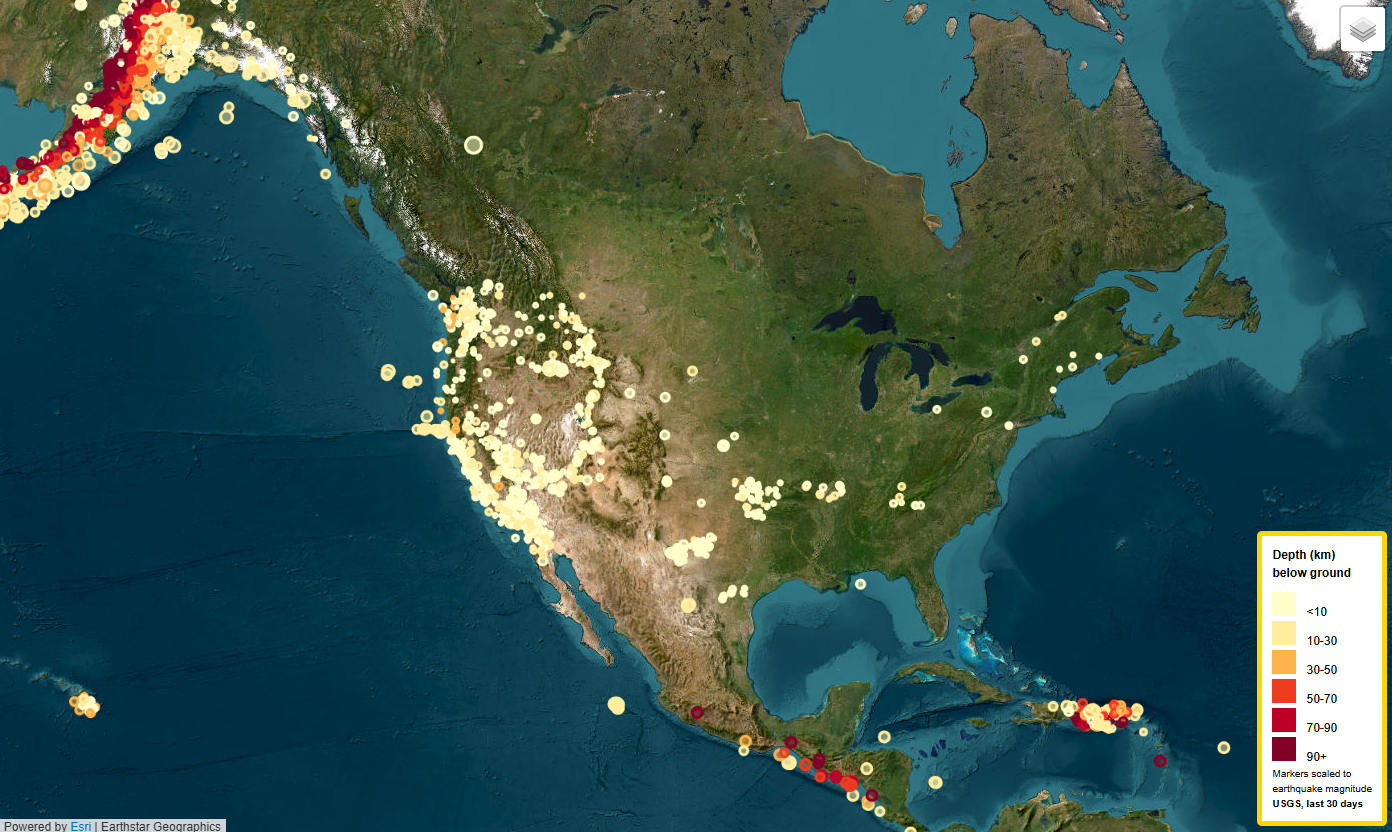 Earthquake markers: Real-time USGS data from the past 30 days,
with markers colored by depth and sized by magnitude.
Earthquake markers: Real-time USGS data from the past 30 days,
with markers colored by depth and sized by magnitude.
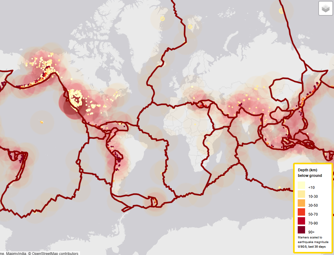 Tectonic plates and heat map: Overlay of earthquake markers and
heat map, highlighting seismic hotspots and plate
boundaries.
Tectonic plates and heat map: Overlay of earthquake markers and
heat map, highlighting seismic hotspots and plate
boundaries.
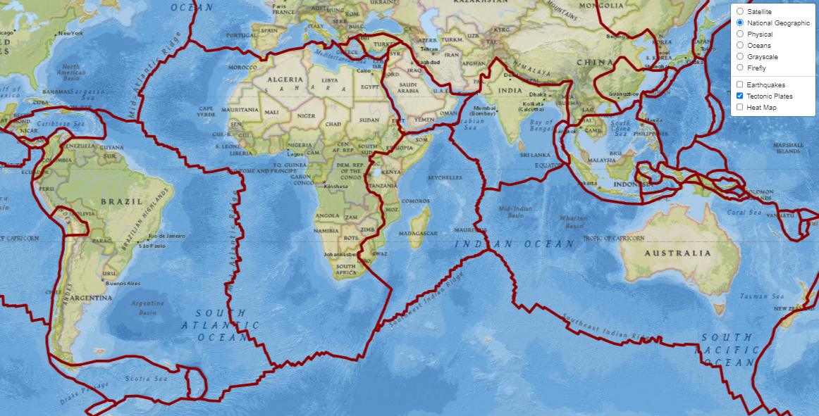 Tectonic plates on ESRI’s National Geographic base map: An
artistic visualization of Earth’s major plate boundaries.
Tectonic plates on ESRI’s National Geographic base map: An
artistic visualization of Earth’s major plate boundaries.
References
Dataset created by the United States Geological Survey.