A data-driven transparency project analyzing costs, donations, and impact for a community fundraiser supporting the Capital Area Food Bank.
Project Links
This project is part thank-you to old friends, part nuts-and-bolts tool for the planning committee. I put together this dashboard to help us see where the money went, set real donation goals, and show everyone—donors and volunteers alike—how their help made a difference. Full of personal touches like photo reels, vintage logos, and COVID gags, it's one of the most heartfelt community projects I’ve been part of.
Project Overview
The Harvest Party is an annual fundraiser supporting the Capital Area Food Bank, blending community, live music, and local food. I used this event as an opportunity to combine personal connection with professional skills, turning historical financial data into meaningful, interactive insights. The audience included both non-technical volunteers and donors, requiring clarity without oversimplification.
The process began with Python-based exploratory data analysis (EDA), where I cleaned and organized multi-year financial data using pandas, matplotlib, seaborn, and Plotly. This foundational step uncovered trends in expenditures, donations, and attendance, setting the stage for downstream analysis.
I then built a mobile-responsive website using JavaScript, styled with Sass and Bootstrap to host dynamic Plotly.js charts. Designed for transparency, the site helps donors and organizers visualize where funds go and how the event performs year to year. Custom touches, like animated masks to reflect the 2020 pandemic, help keep the experience engaging and on-brand.
Finally, I developed a set of interactive Tableau dashboards that deliver explanatory analysis. These dashboards highlight key metrics such as donation trends, spending breakdowns, and cost per attendee, helping stakeholders quickly understand the event’s financial health and identify opportunities to improve impact and efficiency.
By combining technical tools and visual storytelling, this project highlights my ability to not only analyze data but also present it in ways that engage both technical and non-technical audiences.

Alternate, exhaustively comprehensive desktop version here
Gallery
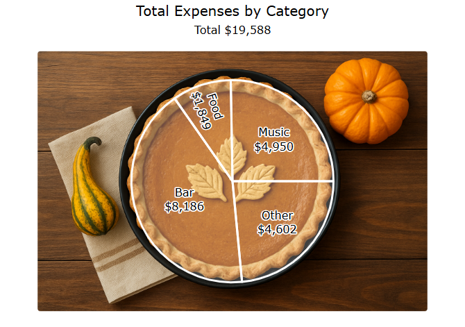 Web pie chart: Categorized expenses overlaid on a pumpkin
pie—festive and thematic, serving up a visual slice of party
spending.
Web pie chart: Categorized expenses overlaid on a pumpkin
pie—festive and thematic, serving up a visual slice of party
spending.
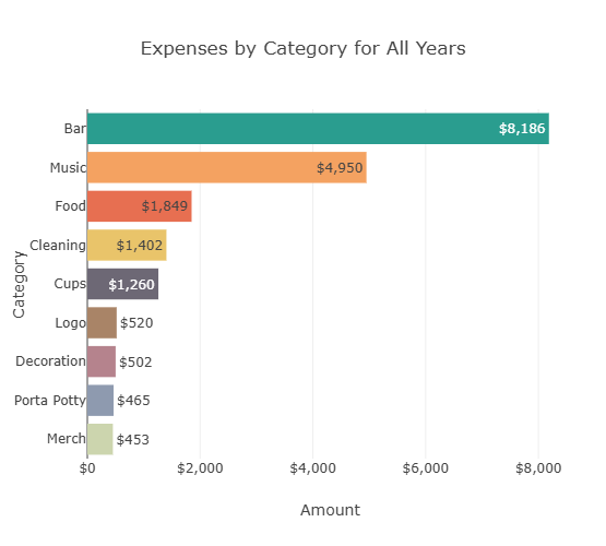 Web bar chart: Cumulative expenses by category, showing that Bar
and Music account for the largest shares.
Web bar chart: Cumulative expenses by category, showing that Bar
and Music account for the largest shares.
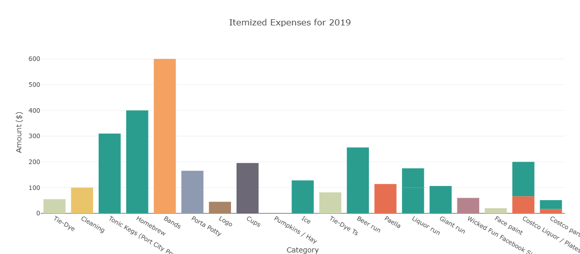 Web bar chart: Itemized expenses for 2019, a typical year,
providing a detailed breakdown of spending.
Web bar chart: Itemized expenses for 2019, a typical year,
providing a detailed breakdown of spending.
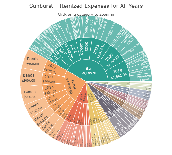 Web Sunburst Plot: Colorful. Visually striking. Possibly a wee
bit unwieldy, but undeniably eye-catching. Made mostly for the fun
of it; opportunities for sunburst charts don’t come around
often.
Web Sunburst Plot: Colorful. Visually striking. Possibly a wee
bit unwieldy, but undeniably eye-catching. Made mostly for the fun
of it; opportunities for sunburst charts don’t come around
often.
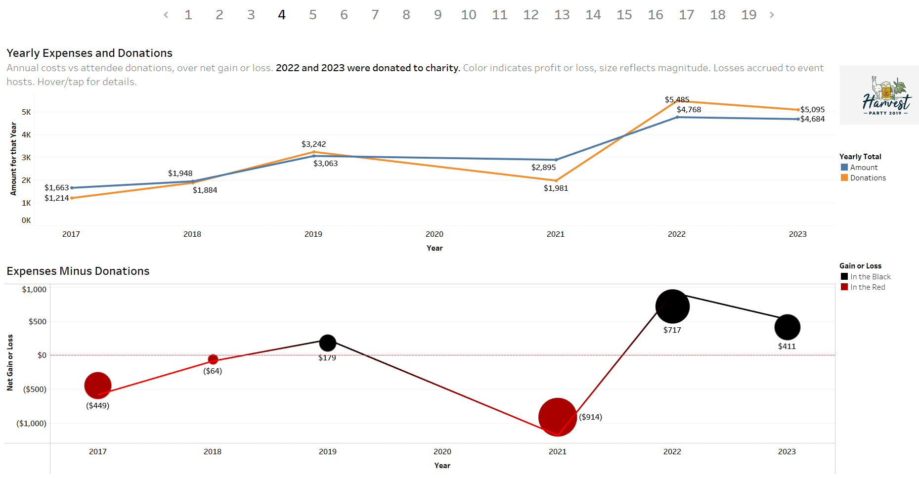 Tableau dashboard: Visualizing expenses, donations, and net
annual gain or loss. Early years show net losses—especially in
2021, post-COVID—followed by a return to positive net
donations.
Tableau dashboard: Visualizing expenses, donations, and net
annual gain or loss. Early years show net losses—especially in
2021, post-COVID—followed by a return to positive net
donations.
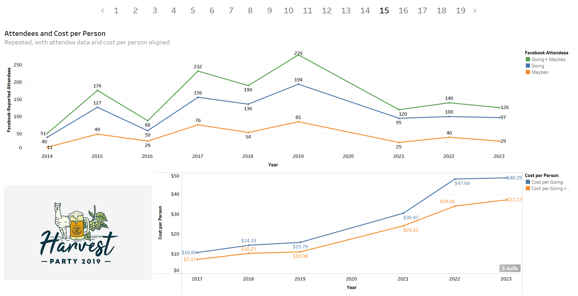 Tableau dashboard: Facebook RSVPs and cost per person. Facebook’s
declining relevance contributes to the apparent drop in attendance
post-COVID. This metric is failing, yet it still doesn’t explain
the tripling of expenses per attendee.
Tableau dashboard: Facebook RSVPs and cost per person. Facebook’s
declining relevance contributes to the apparent drop in attendance
post-COVID. This metric is failing, yet it still doesn’t explain
the tripling of expenses per attendee.
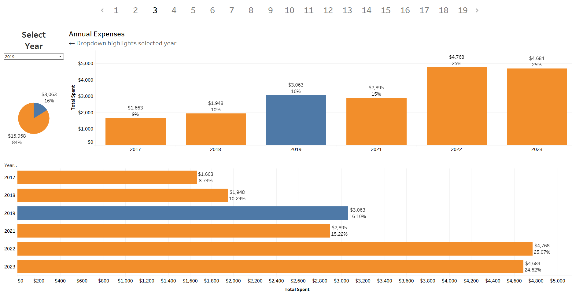 Tableau dashboard: Annual expenses by year, with bar charts
highlighting steadily rising costs.
Tableau dashboard: Annual expenses by year, with bar charts
highlighting steadily rising costs.
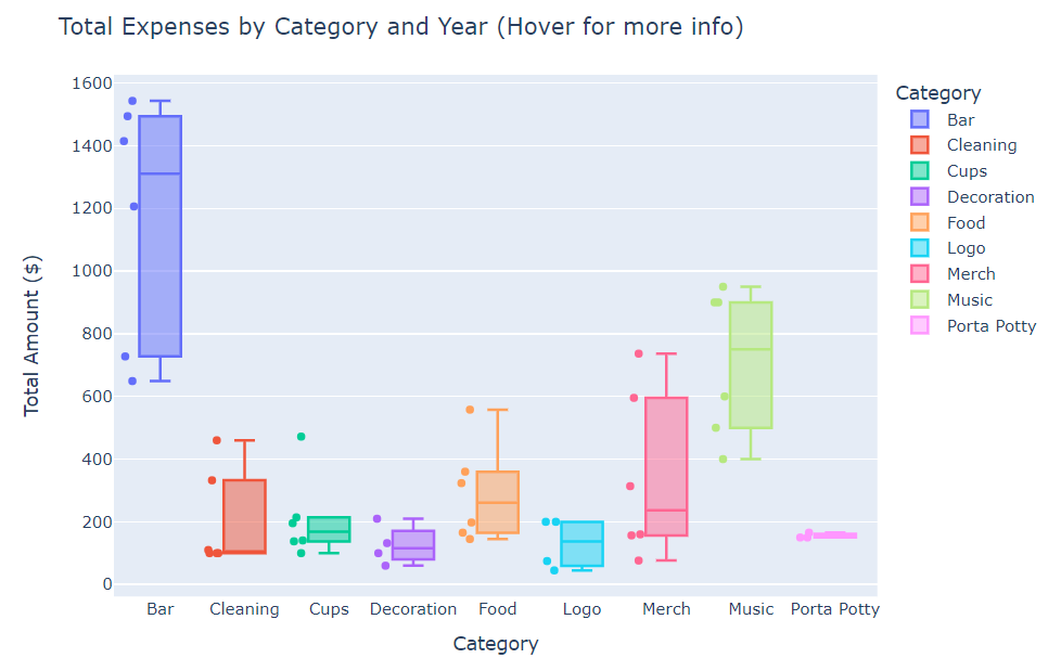 Google Colab EDA: Box and whisker plot showing the distribution
of expenses by category, with Bar and Music consistently the
highest.
Google Colab EDA: Box and whisker plot showing the distribution
of expenses by category, with Bar and Music consistently the
highest.
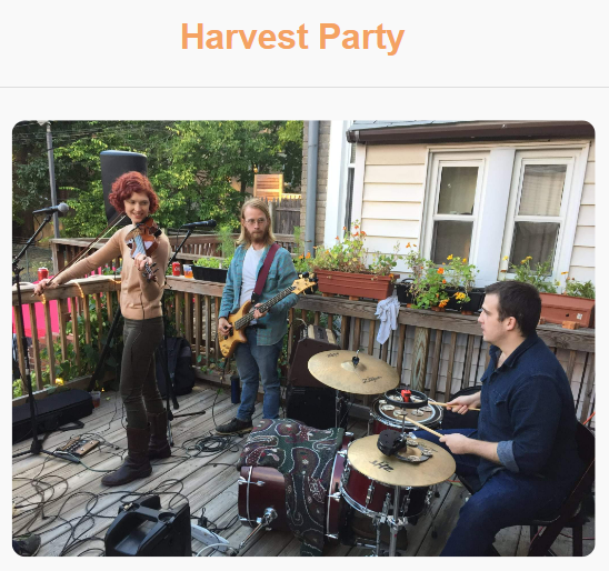
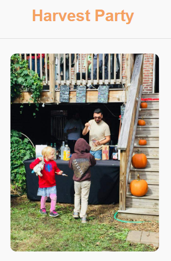

 Images courtesy of the Harvest Party Planning Committee
References
Dataset provided by the Harvest Party Planning Committee.
Heartfelt gratitude to all Harvest Party attendees and the dedicated volunteers who brought this event to life and made it so special year after year.