Microbial ecosystems shape human health, yet remain largely invisible. This interactive dashboard uses citizen science data to make the human microbiome tangible, helping people better appreciate the ecosystems they carry every day, and how little we still know about them.
Project Links
This project sits at the intersection of science communication and data storytelling, and brought real joy to my longstanding curiosity about science. Visualizing data from a public outreach project where volunteers swabbed their belly buttons, I aimed to create visuals that invite curiosity rather than intimidation. It's an approach I now use with any complex or unfamiliar dataset. It celebrates citizen science and healthy microbes—and might just make you wash your belly button.
Project Overview
This dashboard explores microbial diversity using the Belly Button Biodiversity dataset, part of an NC State University public science project. The goal wasn’t technical novelty, but accessibility: transforming microbiome data into an interface that non-specialists could explore and understand intuitively.
Built with Plotly, D3, and Bootstrap, the app includes interactive bar charts (top OTUs per subject), bubble charts (species distribution), and a gauge chart tracking belly button hygiene. It’s a playful but powerful example of making biological data visual, interactive, and publicly engaging.
Gallery
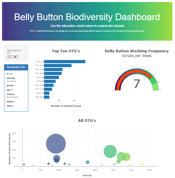 Belly Button dashboard: Visualizing the surprising biodiversity
of beneficial microbes found in our daily lives.
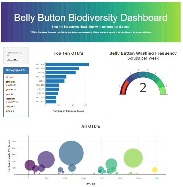
Belly Button dashboard: Visualizing the surprising biodiversity
of beneficial microbes found in our daily lives.
 Alternate dashboard view: Demographic details, bar and bubble
charts of microbial populations, and a gauge tracking washing
frequency.
Alternate dashboard view: Demographic details, bar and bubble
charts of microbial populations, and a gauge tracking washing
frequency.
References
Dataset from the Belly Button Biodiversity Project.